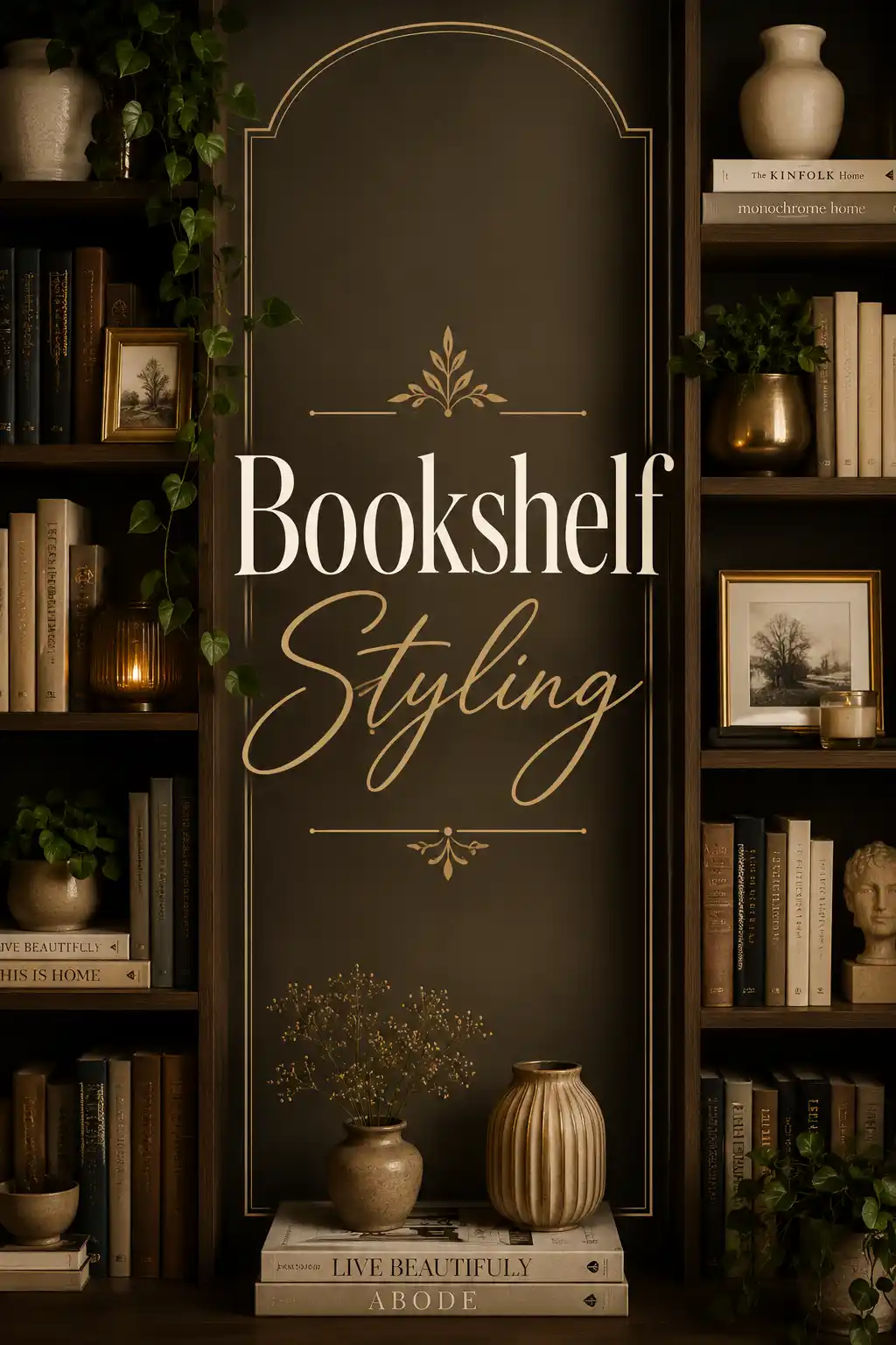
I have rearranged the same bookshelf in my living room probably forty times. That is not an exaggeration. I would get it looking decent, live with it for two weeks, decide something was off, pull everything off, and start over. Books too uniform. Objects too random. Colors clashing. The whole thing feeling like a storage solution rather than something beautiful. I was convinced I simply did not have the eye for it.
Then I started really studying bookshelf styling. Not just Pinterest boards and Instagram posts, but actually reading about the principles behind what made certain shelves look the way they did. And what I discovered was that bookshelf styling is not a mysterious gift that certain people have and others do not. It is a skill built on a set of principles that anyone can learn and apply. Once I understood those principles, everything clicked. My bookshelf went from something I was vaguely embarrassed by to one of the most commented-on features in my home.
This is the complete guide I wish I had found at the beginning of that journey. It covers everything from the foundational principles of bookshelf styling to specific techniques for different shelf configurations, different aesthetic styles, different types of objects, and different challenges like awkward proportions or limited budgets. Whether you are starting from scratch or trying to improve a shelf that is not quite working, this guide has what you need.
Bookshelf styling is genuinely one of the highest-impact, lowest-cost ways to transform the personality of any room. A well-styled bookshelf adds depth, warmth, character, and a sense of the person who lives there in ways that very few other design elements can match. It is worth getting right, and with the right knowledge, it is absolutely within reach.
Understanding the Real Purpose of Bookshelf Styling

Before we get into specific bookshelf styling techniques, it is worth taking a moment to understand what bookshelf styling is actually trying to achieve. Because if you understand the goal, every specific technique makes intuitive sense rather than feeling like a set of arbitrary rules to memorize.
A bookshelf serves two purposes simultaneously. It is a functional storage system for books and objects that need a home. And it is a visual element in the room that contributes to the overall atmosphere, personality, and aesthetic. Bookshelf styling is the art of managing both of these purposes at the same time so that neither compromises the other.
The shelves that look the most effortlessly beautiful are rarely effortless at all. They are the result of intentional decisions about what to include, how to arrange it, how to balance visual weight, and how to create the kind of variety that keeps the eye moving without creating chaos. Understanding that what looks casual and natural is usually carefully considered is one of the first and most important insights in bookshelf styling.
Bookshelf styling also communicates something deeply personal about the person who lives in the space. The books you choose to display, the objects that hold meaning for you, the colors and materials that feel right to you: a well-styled bookshelf tells a story about who you are and how you live in a way that mass-produced decor never can. This is why bookshelf styling is worth the time and attention it requires.
Also Read: The Ultimate Guide to Victorian Gothic Home Decor: Dramatic, Dark, and Deeply Beautiful
The Core Principles Every Bookshelf Styling Expert Follows

There are a handful of principles that underlie essentially all great bookshelf styling. These are not rigid rules that must never be broken, but they are the patterns that appear consistently in styled shelves that work. Learn them, internalize them, and you will find that your instincts about what looks right and wrong on a shelf become dramatically more reliable.
Balance Without Symmetry
Balance is one of the most fundamental principles in bookshelf styling, but balance is not the same as symmetry. Symmetry means each side mirrors the other, every object matched and mirrored precisely. That can look beautiful in certain formal contexts, but in most residential bookshelf styling, perfect symmetry feels stiff and a little lifeless, like a display case rather than a lived-in shelf.
What you are aiming for instead is visual balance, the sense that the overall composition has a stable equilibrium without being a precise reflection. You achieve this through weight distribution. A large heavy object on the left can be balanced by two or three smaller objects on the right. A tall stack of books balances a smaller stack topped with something with significant visual presence. The eye registers this as balanced even though it is not technically symmetrical, and it feels more natural and interesting as a result.
When practicing bookshelf styling, a useful exercise is to step back and half-close your eyes so that the individual objects blur and you see only the overall visual weight distribution. If the composition feels heavy on one side or top-heavy or bottom-heavy, adjust accordingly. Your blurred impression is often more accurate than your detailed inspection when evaluating overall balance.
The Rule of Odd Numbers in Bookshelf Styling
Interior designers have long advocated for odd numbers in groupings, and bookshelf styling is one of the areas where this principle shows up most reliably. Three objects in a group almost always looks more interesting and natural than two or four. Five objects in a cluster beats six. The reason is that odd-numbered groups resist the automatic visual pairing that even numbers create, which forces the eye to work a little harder and find its own path through the composition.
In practice, bookshelf styling using the rule of odd numbers means organizing each shelf and each section of a shelf in groups of three or five. Three books standing upright, a small object beside them, and then a stack of two books horizontally creates a grouping of three distinct visual elements. This rhythm repeated across the shelf with variation in scale and type creates an engaging visual experience that is genuinely pleasurable to look at.
The odd-numbers principle in bookshelf styling also applies to repetition. If you are using plants across multiple shelves, three plants placed at different heights and scales will always look more considered than two or four. If you are repeating a color accent, five appearances of that color will feel more rhythmic and intentional than six. This is one of those bookshelf styling principles that sounds abstract until you try it and then wonder how you ever worked without it.
Varying Heights for Visual Interest

One of the most immediately effective bookshelf styling techniques is deliberately varying the heights of objects across each shelf. A row of books all standing at the same height, regardless of how well-matched their spines are, creates a flat, uninteresting horizontal line. Introducing variety through different book heights, horizontal stacks that create lower platforms, and objects of varying scales creates what designers call visual rhythm, a pleasing up-and-down movement across the shelf that keeps the eye engaged.
In bookshelf styling, the classic way to vary heights combines upright books of different heights, a horizontal stack of two or three books creating a lower surface, an object placed on top of the stack to create a mid-height element, and a taller object like a vase or plant reaching toward the shelf above. This creates a mini-landscape on a single shelf that has a peak, a valley, and a middle ground, which is compositionally satisfying in the same way a landscape painting is.
When thinking about height variation in bookshelf styling, it is also worth considering the relationship between adjacent shelves. The composition of each shelf does not exist in isolation. The height profile of one shelf should complement the height profile of the shelf above and below it, creating an overall visual flow across the entire bookshelf that is cohesive rather than each shelf feeling completely disconnected from its neighbors.
Depth and Layering
One of the techniques that distinguishes truly excellent bookshelf styling from amateur attempts is the use of depth and layering. Most bookshelves have twelve to fourteen inches of depth, and the instinct is to line everything up at the front edge of the shelf. But this creates a flat, one-dimensional composition that lacks the richness of a layered arrangement.
Using depth in bookshelf styling means deliberately placing some objects further back on the shelf and others closer to the front, creating a sense of recession that adds genuine three-dimensionality to the composition. A framed photograph leaning against the back wall of the shelf with smaller objects arranged in front of it uses the full depth of the shelf and creates a scene rather than a lineup.
Layering also involves the visual overlap of objects, where one element partially obscures another in an intentional way. In bookshelf styling, a small object placed in front of a taller one creates a sense of depth through overlap. Books arranged so that a small figure stands in front of the spines creates a layered foreground-background relationship that feels rich and considered. These depth techniques are what separate bookshelf styling that looks flat in photos from styling that looks dimensional and engaging.
Books: The Foundation of All Great Bookshelf Styling

Books are presumably the primary content of any bookshelf, and how you treat them in your bookshelf styling has an enormous impact on the overall result. There is a spectrum of approaches to books in bookshelf styling, from treating them as purely functional storage to treating them as purely decorative objects, and the best bookshelf styling typically finds a thoughtful middle ground.
Organizing Books for Bookshelf Styling
The organization system you choose for your books is one of the most personal decisions in bookshelf styling, and there is no universally right answer. Color-coded organization, where books are arranged by the color of their spines in a gradient or palette, creates one of the most visually dramatic effects in bookshelf styling. It is incredibly beautiful and makes excellent photography. The practical trade-off is that finding a specific book requires remembering its color rather than its location.
Arranging books by subject or genre is the organization system that works best for serious readers who want to actually use their bookshelf as a reference system. In bookshelf styling terms, it requires more creative management to make the visual result compelling, since subject-grouped books often have wildly varying spine colors and heights. Breaking the collection into clusters with decorative objects between the clusters helps organize the visual complexity.
Height organization, where books are arranged in descending or ascending height order within a section, creates a pleasing stepped profile that is both organized and visually satisfying in bookshelf styling. It also reduces the visual chaos that results from randomly sized books side by side. Combining height organization within color families gives you both the visual coherence of color grouping and the clean profile of height organization.
Mixing Vertical and Horizontal Books
The combination of vertical and horizontal book arrangements is one of the most universally recommended bookshelf styling techniques, and for good reason. It introduces height variety naturally, creates platforms for displaying objects, and breaks up the monotony of a wall of upright spines. The question is how to execute this in a way that looks intentional rather than like you ran out of shelf space.
In bookshelf styling, horizontal stacks typically work best at the ends of vertical groupings or as punctuation marks between sections. A stack of three to five books laid horizontally creates a low platform that can support a decorative object, and the transition from the stack to the upright books beside it creates a natural visual beat in the composition. Stacks in the middle of a shelf also work well when the stack height and the object placed on top create an interesting height counterpoint to the books on either side.
The number of books in a horizontal stack matters in bookshelf styling. Two books feel sparse. Three to five books feel intentional. More than five starts to look like overflow storage rather than a stylistic choice. The size and visual weight of the books in the stack also matters: beautiful oversized art books or coffee table books with attractive covers make spectacular horizontal stacks because the covers contribute to the composition even when the spines are hidden.
Facing Books Forward in Bookshelf Styling
Facing some books with their covers toward the viewer rather than their spines is a bookshelf styling technique that adds visual variety and allows particularly beautiful book covers to become part of the composition. This works especially well with art books, travel photography books, and any book with a cover that has genuine visual appeal. A single book faced forward among a row of spines creates an immediate focal point on that section of the shelf.
Floating bookshelves, which are designed specifically for face-out display of a single book, have become popular in interior design in recent years. But the same effect can be achieved on conventional shelves in bookshelf styling by simply propping a beautiful book against the back wall at an angle, leaning it against other books, or using a small bookstand to hold it upright facing the viewer. The key is using covers that are genuinely beautiful rather than displaying books randomly face-out.
Color is another consideration in how books are treated in bookshelf styling. Books with neutral or attractive spines can be displayed with spines out. Books with very unappealing or visually clashing spines can be turned around so the pages face forward, which creates a uniform cream or white tone that reads as neutral. This reverse-spine technique has become popular in editorial bookshelf styling and works beautifully for creating a cohesive visual palette.
Decorative Objects That Elevate Your Bookshelf Styling

The decorative objects you choose for your bookshelf styling are what transform a book storage system into a curated display that reflects your personality and aesthetic. But selecting and placing objects effectively is one of the most nuanced aspects of bookshelf styling, because the wrong objects or too many objects or poorly chosen combinations can make even the most beautifully organized books look cluttered and confused.
Types of Objects That Work in Bookshelf Styling
Not every beautiful object you own belongs on a bookshelf, and not every bookshelf needs the same types of objects. The most universally successful categories for bookshelf styling are objects with interesting forms, natural textures, or personal significance. Ceramic vessels of various shapes and sizes. Small sculptures or figurines with clean silhouettes. Framed photographs or small artworks. Candles and candle holders. Natural elements like stones, shells, or dried botanicals.
The most important criterion for objects in bookshelf styling is scale. Objects that are too small disappear among books and read as clutter rather than decoration. Objects that are too large overwhelm the shelf and look like they landed in the wrong place. The sweet spot in bookshelf styling is objects that are substantial enough to register clearly as decorative elements but proportionate to the shelf height and book sizes around them. As a rough guide, objects should be at least one-third the height of the shelf space to read properly.
Texture variety is another important consideration in object selection for bookshelf styling. A shelf where everything is the same material, say all ceramic, feels one-dimensional. Mixing materials creates tactile and visual richness. Smooth ceramics alongside rough natural stone. Glossy glass alongside matte linen. Metal beside organic wood. These material contrasts in bookshelf styling create interest and sophistication that a single-material approach cannot achieve.
Vases and Vessels in Bookshelf Styling

Ceramic and glass vases, vessels, and bowls are among the most universally useful objects for bookshelf styling because they come in such a wide range of heights, proportions, colors, and surface treatments that you can almost always find something that works perfectly for any shelf situation. They photograph beautifully, they age gracefully, and they add the kind of handmade quality that mass-produced decorative objects rarely achieve.
When using vases in bookshelf styling, vary their heights significantly. Three vases of identical height grouped together look generic. Three vases where one is tall and slender, one is medium and rounded, and one is small and textured create a much more interesting composition. Empty vases are perfectly valid in bookshelf styling and often look better than vases holding artificial flowers, which can cheapen a shelf’s appearance immediately.
Fresh or dried botanicals in vases are one of the most beautiful additions to bookshelf styling. A single stem of dried pampas grass in a tall neutral vessel adds height, texture, movement, and a softness that no manufactured object replicates. Dried flowers, eucalyptus, and cotton stems all work beautifully in bookshelf styling and last much longer than fresh flowers while maintaining their beauty.
Art and Framed Pieces in Bookshelf Styling
Incorporating art into bookshelf styling is one of the most effective ways to add visual anchor points and personal meaning to a shelf composition. Small framed prints or photographs leaning against the back wall of a shelf, or propped against a group of books, create focal points that draw the eye and ground the surrounding composition. They also add a layer of personal narrative to the bookshelf that purely decorative objects cannot provide.
The most common mistake with art in bookshelf styling is using frames that are too small to register as significant design elements. A frame that gets lost among books and objects contributes little to the composition and creates visual noise rather than a focal point. In bookshelf styling, art frames should be substantial enough to be immediately noticed and appreciated. Ideally at least five by seven inches, and often larger depending on the shelf size.
Leaning art at a slight angle rather than mounting it completely straight creates a casual, collected quality in bookshelf styling that feels more personal and less displayed. This technique works particularly well for creating the impression that the shelf is a natural collection rather than a formal presentation. The slight imperfection of a leaned frame is one of those counterintuitive bookshelf styling techniques that makes the whole shelf feel more human.
Plants and Natural Elements in Bookshelf Styling
Plants are one of the most transformative elements in bookshelf styling because they bring genuine life, movement, and organic beauty to the shelf in ways that manufactured objects simply cannot replicate. A trailing plant like a pothos or string of pearls spilling over the edge of a shelf softens the hard geometry of the books and objects below it. A small-leaved succulent in a beautiful pot adds color and texture. A simple cutting in a small glass vase adds vitality.
The placement of plants in bookshelf styling matters enormously. A trailing plant works best on a higher shelf where its trailing vines can cascade downward without being obstructed. An upright plant like a small fiddle leaf fig or rubber plant works well at the end of a shelf where it can reach upward without competing with books. A small succulent or cactus works well tucked among objects on any shelf as a textural accent.
The light requirements of plants are a genuine practical consideration in bookshelf styling. Most bookshelves are not positioned near windows, which means low-light tolerant plants like pothos, ZZ plants, snake plants, and philodendrons are the most reliable choices for shelves that do not receive direct sunlight. High-quality faux plants have improved significantly in quality and are a legitimate option in bookshelf styling for shelves that receive no usable light.
Color Theory Applied to Bookshelf Styling

Color is one of the most powerful tools in bookshelf styling and one of the areas where people most often struggle. A shelf where every color is a random occurrence looks chaotic regardless of how well the objects are arranged. A shelf where color is deliberately managed feels cohesive, calm, and professional even when the individual objects are very simple.
Building a Color Palette for Your Bookshelf Styling
The most effective approach to color in bookshelf styling is building around a palette of three to four tones that work together. A neutral base, typically white, cream, warm gray, or natural wood tones, provides the background against which more prominent colors read clearly. One or two accent colors appear repeatedly across the shelf to create visual continuity. And a small amount of a contrasting or complementary color appears as a sparingly used accent that adds interest without disrupting the palette.
Warm neutrals, specifically cream, linen, warm white, and natural wood tones, are the most universally successful base for bookshelf styling because they complement almost any accent color and make both books and objects look their best. They also tend to align with the natural color of most hardcover books, which creates a default harmony between the books and the background of the shelf.
When selecting objects for bookshelf styling, buy to your palette rather than buying whatever is beautiful in isolation. An object that is beautiful on its own but brings in a color that does not appear anywhere else on the shelf will read as a visual outlier that disrupts the composition. This discipline, choosing objects that serve the palette rather than objects you simply like in the abstract, is one of the most important habits in professional bookshelf styling.
Using Color to Create Visual Flow

Repeating accent colors across multiple shelves creates visual flow in bookshelf styling, a sense that the eye is being guided around the whole composition rather than stopping at individual elements. If you have chosen terracotta as an accent color, for example, placing terracotta-toned objects on the first shelf, the third shelf, and the fifth shelf creates a visual rhythm that makes the entire bookshelf feel coherent and intentional.
Color grouping, where books with similar spine colors are arranged together, is one of the most dramatic bookshelf styling techniques and the one most widely seen in interior design photography. A rainbow bookshelf, organized through the full spectrum from red to violet, is visually arresting and works beautifully in photography. More subtle approaches, like grouping warm-toned books together and cool-toned books together, create a less literal but equally effective color-organized result.
Negative space, which is the empty space on a shelf with no objects, is a color in its own right in bookshelf styling. The color of the shelf or back panel becomes a visual element. Painting the back panel of a bookshelf a contrasting color is one of the most popular bookshelf styling upgrades precisely because it turns what was previously a blank background into an active color element. Deep navy, forest green, warm terracotta, and rich burgundy are all popular back panel colors in bookshelf styling.
Bookshelf Styling for Different Interior Design Styles

Bookshelf styling does not exist in a vacuum. The most successful approach to styling any bookshelf is one that is coherent with the overall interior design style of the room it sits in. A maximalist bohemian bookshelf in a minimal Scandinavian room creates a jarring visual conflict. A spare minimal shelf in a maximalist eclectic room feels underdone and out of place. Understanding how to adapt bookshelf styling principles to different aesthetic contexts is essential for a result that feels genuinely right.
Minimalist Bookshelf Styling
Minimalist bookshelf styling is arguably the most demanding approach because the restraint required goes against the natural accumulation tendency of most book owners. In minimalist bookshelf styling, every single object on the shelf must earn its place. There is no space for anything that does not contribute meaningfully to the composition. The result, when done well, is extraordinarily powerful, a shelf that feels like a considered statement rather than a collection.
The principles of minimalist bookshelf styling center on editing ruthlessly, using a very limited color palette of two to three tones maximum, leaving significant empty space on each shelf, and choosing objects with genuinely excellent form rather than sentimental value. In minimalist bookshelf styling, one perfect object is worth ten mediocre ones. The empty space between and around objects is as important as the objects themselves, giving each element room to breathe and be appreciated individually.
Books in minimalist bookshelf styling are typically edited to a curated selection rather than a complete collection. The books that remain may be organized by color in a very controlled palette, arranged with extreme precision in height order, or kept to a single shelf while the remaining shelves hold only the most essential objects. The overall effect is a bookshelf that communicates thoughtfulness and intentionality in every detail.
Maximalist Bookshelf Styling
Maximalist bookshelf styling is not simply piling more things onto a shelf. True maximalist bookshelf styling is abundant, layered, and rich, but it still follows the core principles of balance, visual weight management, and color cohesion. The difference from minimalism is that maximalism pursues richness and abundance rather than restraint, but the underlying discipline is equally present.
In maximalist bookshelf styling, the key to preventing chaos is strong color logic. When objects and books are extremely varied in type and form, as they are in maximalist styling, color becomes the organizing principle that ties everything together. A maximalist bookshelf with a coherent warm earthy palette feels rich and layered. The same shelf without color logic feels like a storage explosion.
Layering is perhaps the most important technique in maximalist bookshelf styling. Objects placed in front of books, smaller objects placed in front of larger ones, framed pieces leaning against others: the depth and overlap created by layering is what gives maximalist shelves their characteristic richness. The goal in maximalist bookshelf styling is a shelf that rewards extended looking, revealing more detail and more connection the longer you study it.
Mid-Century Modern Bookshelf Styling
Mid-century modern bookshelf styling draws on the aesthetic vocabulary of the 1950s and 1960s design movement, characterized by clean organic lines, warm wood tones, functional forms with elegant proportions, and a restrained color palette of warm neutrals with specific accent colors like mustard yellow, olive green, rust orange, and warm teal. Objects in mid-century modern bookshelf styling tend to have strong geometric or organic silhouettes and honest materials.
Furniture-style objects work particularly well in mid-century modern bookshelf styling. Small sculptural pieces with strong form, pottery with clean profiles in earthy glazes, small wooden objects or turned vessels, and objects in brass or matte black metal all feel authentically mid-century in their aesthetic. Books with clean modern spines or art books featuring mid-century photography and design are natural companions on a mid-century styled shelf.
Avoiding contemporary clutter is important in mid-century modern bookshelf styling. The style rewards selective display and intentional groupings rather than the layered abundance of maximalist approaches. Each shelf in mid-century modern bookshelf styling should feel like it was designed with a specific arrangement in mind, with clear visual logic connecting the objects chosen and their placement.
Coastal and Natural Bookshelf Styling

Coastal and natural bookshelf styling draws from the textures, colors, and objects of the natural world to create shelves that feel calm, organic, and grounded. The palette leans toward natural neutrals, soft whites, sandy creams, driftwood tones, and the occasional soft blue or seafoam green. Objects favor natural materials and textures: woven baskets, shells and driftwood, smooth stones, ceramic in earthy glazes, and plants in abundance.
The bookshelf styling approach for coastal and natural interiors prioritizes texture over form. Where a minimalist shelf might feature a single perfect ceramic, a coastal shelf might have a grouping of mixed natural objects, shells beside smooth river stones beside a piece of weathered wood, where the interest comes from the varied textures rather than strong graphic forms. This tactile richness creates a shelf that feels genuinely natural rather than styled.
Practical Bookshelf Styling for Every Type of Shelf

Different types of bookshelves present different challenges and opportunities for bookshelf styling. The principles remain consistent, but their application looks different depending on the shelf configuration. Understanding how to adapt your approach to the specific shelf you are working with is an important practical skill.
Floor-to-Ceiling Built-In Bookshelf Styling
Floor-to-ceiling built-in bookshelves are the most dramatic canvas for bookshelf styling and also the most demanding. The sheer scale means that every decision is amplified, both the good ones and the mistakes. Small inconsistencies in the lower shelves are noticeable because they are at eye level. Proportional errors in the upper shelves, where objects may be too small to read clearly from below, require specific correction through scale thinking.
The most important principle in floor-to-ceiling bookshelf styling is treating the entire bookcase as a single unified composition rather than a stack of independent shelves. The eye takes in the whole when looking at a tall bookshelf, and the overall visual impression matters as much as the arrangement of individual shelves. This means the color distribution, the height variation, and the distribution of different types of objects should be managed across the whole vertical plane.
Upper shelves in floor-to-ceiling bookshelf styling require larger objects than lower shelves to read properly at height. An object that looks perfectly scaled on a mid-height shelf will appear tiny and insignificant when placed on the top shelf of a nine-foot bookcase. Scale up your objects as you move upward, and consider using tall items with strong silhouettes, like large vases, substantial sculpture, or baskets, on upper shelves where scale is critical.
Floating Wall Shelf Styling
Floating shelves present some of the most specific challenges in bookshelf styling because their minimal form and individual nature means there is nothing else in the installation to contextualize each shelf. Each shelf exists as a complete visual unit, and its composition must stand alone. There is no adjacent shelf to balance against, no shared back panel to unify. Every floating shelf in a bookshelf styling context must be a complete composition in itself.
For groups of floating shelves arranged in a cluster, as is common in contemporary interior design, the bookshelf styling challenge becomes managing the relationship between the shelves as well as the composition of each individual one. The overall arrangement of multiple floating shelves should create a visual shape that works as a unified element on the wall, with the spaces between shelves as considered as the shelves themselves.
Because floating shelves are typically smaller than full bookcase shelves, bookshelf styling for floating shelves tends toward fewer objects with more presence per shelf. Two or three well-chosen objects plus a few books often produces better results than attempting to replicate the layered abundance of a full bookcase in a compact space. Restraint is generally more appropriate at smaller scales in bookshelf styling.
Cube and Grid Shelf Styling
Cube shelving units present a unique bookshelf styling challenge because the rigid geometric structure of equal-sized squares or rectangles creates a framework that can either work with or against the natural variation of a good styling composition. The most common mistake in cube shelf bookshelf styling is treating each cube as a separate entity with no relationship to its neighbors, which produces a disjointed result where none of the individual squares connect into a coherent whole.
Effective bookshelf styling for cube units involves thinking about which cubes will be fully packed with books, which will feature a single decorative object, which will hold baskets or boxes for concealed storage, and how these different treatments will be distributed across the grid to create an overall pattern that is balanced and visually interesting. A checkerboard of open and closed cubes, or a diagonal pattern of heavily loaded and lightly populated cubes, creates visual rhythm in the grid.
Varying the orientation of books within cube bookshelf styling also adds interest. Some cubes with horizontal stacks, some with vertical books, some with a single face-out book propped against the back: this variety within the consistent grid structure creates the combination of order and variation that makes for compelling bookshelf styling.
The Editing Process in Bookshelf Styling
One of the most important skills in bookshelf styling is knowing what to remove. Most first attempts at bookshelf styling suffer not from too little but from too much. Too many objects competing for attention. Too much visual complexity preventing the eye from resting anywhere. The editing process, the deliberate removal of things that are not contributing positively to the composition, is what transforms a shelf that feels cluttered into one that feels curated.
The most useful technique for editing in bookshelf styling is to style the shelf completely and then remove twenty to thirty percent of what you have put on it. This sounds counterintuitive, but the items you remove tend to be the ones that were filling space rather than contributing to the composition. After removal, the remaining objects breathe better, the spaces between them become positive elements in the design, and the overall quality of the composition almost always improves.
A fresh set of eyes is invaluable in bookshelf styling editing. When you have been staring at the same shelf for an hour, you lose the ability to see it objectively. Walking away for thirty minutes and returning with fresh eyes, or asking someone else to give you their first impression, reveals what is working and what is not in a way that prolonged close inspection cannot. Your first-impression reaction to a shelf, the feeling you get in the first two seconds of looking at it, is often the most honest assessment of whether the bookshelf styling is working.
What to Store Off the Shelf in Bookshelf Styling
Part of the editing process in bookshelf styling is accepting that not everything deserves to be displayed. Books you never read but cannot bear to part with can go in a less prominent location. Objects that you like but that do not contribute to the color palette or aesthetic you are going for can be stored elsewhere and rotated in seasonally. Practical items like charging cables, remote controls, and everyday supplies should never be visible in bookshelf styling.
Baskets, boxes, and lidded containers are essential bookshelf styling tools for concealing the practical storage needs that every real household has. A beautiful woven basket on a lower shelf can conceal board games, extra chargers, or anything else that needs to be accessible but not displayed. Decorative boxes in materials that complement your bookshelf styling palette do the same job for smaller items. The combination of concealed and open storage in bookshelf styling creates shelves that are both beautiful and genuinely functional.
Seasonal and Occasional Bookshelf Styling Updates
One of the most enjoyable aspects of bookshelf styling is that it does not have to be permanent. Unlike painting a wall or replacing flooring, bookshelf styling can be changed, refreshed, and updated whenever the mood strikes. Many interior designers recommend doing a seasonal refresh of bookshelf styling to keep the space feeling current and personal throughout the year.
Seasonal bookshelf styling updates do not require buying entirely new objects every three months. They typically involve bringing in a few seasonal elements, pine cones and candles in winter, fresh flowers and lighter objects in spring, botanical elements and warmer tones in autumn, and rotating out a few of the pieces that have been on the shelf through the previous season. This rotation keeps both the bookshelf and the objects themselves feeling fresh and appreciated.
The investment in a small collection of seasonal objects for bookshelf styling across the year is actually quite modest when spread over time. A few well-chosen pieces for each season, stored carefully when not in use, create an ongoing bookshelf styling capability that lets the shelf evolve with the calendar. This practice also means you are constantly practicing bookshelf styling and therefore constantly improving your instincts and skills.
Celebrating Personal Collections in Bookshelf Styling
One of the most meaningful directions bookshelf styling can take is the deliberate celebration of a personal collection. If you collect vintage cameras, seashells from beaches you have visited, miniature buildings from travels, handmade pottery, or any other category of meaningful objects, the bookshelf is the perfect place to display that collection in a way that honors it while integrating it into the overall design of the room.
Collection-based bookshelf styling requires thinking about how to display a group of similar objects with variety and visual interest while maintaining the sense that they belong together. Varying the spatial distribution across multiple shelves, alternating between tight groupings and single prominent placements, and mixing the collected objects with books and other items so they are incorporated rather than segregated: these approaches create bookshelf styling that celebrates a collection without turning the shelf into a display case.
Budget Bookshelf Styling: Beautiful Results Without Expensive Objects

One of the most liberating truths about bookshelf styling is that it does not require expensive objects to look beautiful. Some of the most stunning shelves I have seen were composed almost entirely of things the homeowner already owned, supplemented with a few inexpensive finds from thrift stores, charity shops, and discount home stores. The skill in bookshelf styling matters far more than the price tag of the objects used.
The first step in budget bookshelf styling is a thorough audit of what you already own. Look through every room of your house for objects that could work on the shelf. Small objects hiding in drawers. Books stacked in other rooms. Objects that have been in the same place so long you no longer really see them. Bringing these existing pieces into the bookshelf styling conversation often produces a selection richer than you expected without spending anything.
Thrift stores and charity shops are genuinely excellent sources for bookshelf styling objects, particularly ceramics, small sculptures, wooden objects, and vintage books with beautiful covers. The key is learning to see past the thrift store context and assess whether an object has genuinely good form, interesting texture, or beautiful color that would work in your bookshelf styling. With practice, this eye for potential becomes one of the most useful skills in creating beautiful shelves economically.
DIY Bookshelf Styling Accents
Simple DIY projects can create beautiful bookshelf styling accents at almost no cost. A collection of smooth river stones arranged in a small bowl or tray. A dried botanical arrangement made from garden clippings. A simple candle holder made from a slice of wood with a drilled recess. A framed piece of interesting wrapping paper or a printed artwork. These homemade objects often have the imperfection and personality that mass-produced decor lacks and they integrate beautifully into bookshelf styling because they feel genuine.
Painting existing objects is one of the most effective budget bookshelf styling techniques. A spray can of matte white, warm cream, or earthy terracotta paint can transform an object that does not currently fit your bookshelf styling palette into one that does perfectly. Old vases, ceramic figures, picture frames, and wooden objects can all be paint-transformed into pieces that feel purpose-made for your shelf at the cost of a five-dollar spray can.
Common Bookshelf Styling Mistakes and How to Fix Them

Understanding the most common mistakes in bookshelf styling is just as valuable as understanding what to do, because often the fastest way to improve a shelf that is not working is to identify and fix a specific error rather than starting over completely. These are the mistakes I see most frequently and the corrections that typically resolve them quickly.
The most common bookshelf styling mistake is overcrowding. When a shelf has too many objects, the eye has nowhere to rest and the composition reads as cluttered regardless of how individually attractive the objects are. The fix is ruthless editing: remove objects until the composition breathes. The discomfort many people feel about empty space on a shelf is a significant obstacle to great bookshelf styling that is worth deliberately overcoming.
The second most common mistake is uniform scale. When all the objects on a shelf are roughly the same size, there is no visual hierarchy and no height variation to create interest. The fix is introducing at least one object that is significantly larger or taller than the others, creating a clear focal point, and at least one that is small enough to function as a textural accent. This range of scale creates the visual hierarchy that makes bookshelf styling feel professional rather than random.
Poor color management is the third most common bookshelf styling problem. When colors appear randomly with no relationship to each other, the shelf feels chaotic. The fix does not require replacing objects but rather redistributing them so that color accents appear in a rhythm across the shelf, and removing any objects whose color disrupts the palette you are building toward. Sometimes turning books backward so only the pages face out resolves a color clash problem quickly and effectively.
Fixing a Flat Bookshelf Styling Composition
A flat composition, one where everything is lined up at the front edge of the shelf with no depth variation, is one of the more subtle bookshelf styling problems but a very common one. The fix is introducing depth by pushing some objects to the back of the shelf and layering others in front. Leaning a framed photograph or a tall object against the back wall while arranging smaller objects in front of it at the front edge of the shelf creates immediate depth and dimensionality.
A shelf that lacks personality despite having good organization typically suffers from an absence of personal or organic elements. Books and ceramic objects alone, however beautifully arranged, can feel a little sterile in bookshelf styling. Adding a plant, a meaningful personal object, or a piece of handmade pottery typically introduces the warmth and human quality that transforms a composed shelf into one that feels genuinely personal and lived-in.
Photography Tips for Showcasing Your Bookshelf Styling

Once you have invested the time and thought into bookshelf styling that genuinely works, you naturally want to capture it well in photography. Whether for personal satisfaction, social media sharing, or documentation before a move, good photography significantly enhances how bookshelf styling reads. And while professional photography is beyond most people’s everyday toolkit, a few simple techniques make a significant difference in how bookshelf styling translates to photographs.
Natural light is the single most important factor in bookshelf styling photography. Position your camera or phone so that natural window light falls across the shelf from one side rather than shooting directly into a window. This side lighting creates depth and shadow that makes the objects on the shelf three-dimensional in the photograph. Direct overhead artificial light flattens everything and usually creates unflattering reflections on any glossy surfaces.
Shooting slightly from the side rather than directly straight on creates depth and perspective in bookshelf styling photography that a straight-on shot cannot achieve. A slight angle reveals the depth of the shelf, shows the layering of objects front to back, and creates a more dynamic composition in the photograph. Experiment with shooting from slightly below the shelf level as well, as this angle often makes bookshelf styling compositions look more dramatic and editorial.
Final Thoughts
Bookshelf styling is one of those skills that genuinely improves the more you practice it. Your first attempt will be better than your instinct without knowledge. Your fifth will be better than your first. And by the time you have styled and restyled your bookshelf a dozen times, you will find that your eye has developed to the point where you can quickly assess what is working and what needs adjusting, where the balance needs correcting, which objects are not contributing, and what the composition is missing.
The principles in this guide are not arbitrary rules. They reflect how human visual perception actually works, what creates harmony and what creates tension, what holds attention and what causes fatigue, what feels personal and what feels generic. When you apply them thoughtfully to your own bookshelf, adapting them to your specific space, your specific collection, and your specific aesthetic, the result is a bookshelf that is genuinely yours and genuinely beautiful.
That is the thing about great bookshelf styling. It looks effortless but it is not. It looks natural but it is considered. It looks like it just happened that way but it is the result of decisions about balance and scale and color and depth and editing that someone made deliberately and thoughtfully. And when those decisions are right, the bookshelf becomes one of the most personally expressive elements in the entire home, a small world you made that tells a story about you every time someone looks at it.
Start with the principles. Experiment with the techniques. Edit fearlessly. And give yourself permission to keep changing it until it feels exactly right, because unlike almost every other element of interior design, bookshelf styling welcomes revision. The best shelf you will ever have is always the next one you style.
Frequently Asked Questions
1. How do I start bookshelf styling if I have never done it before?
Start by completely clearing the bookshelf and everything that was on it. This blank slate is important because bookshelf styling with a completely fresh beginning almost always produces better results than trying to work with what is already there. Then sort everything into categories: books, decorative objects, plants, functional items. Edit out anything that does not belong in the space or does not contribute to the look you want. Begin with the books, organizing them in a way that creates visual appeal, then add objects in groups using the principles of odd numbers, height variation, and color cohesion. Step back frequently and assess the overall impression rather than focusing too closely on individual elements.
2. How many decorative objects should I put on a bookshelf?
The ideal number of decorative objects in bookshelf styling depends on the size of the shelf and the aesthetic you are pursuing, but as a rough guideline, about thirty percent objects to seventy percent books tends to create a balanced composition for most full bookcases. For floating shelves or smaller units, the ratio might shift toward more objects and fewer books. The most important principle is that the objects should feel curated rather than collected, with enough empty space between groups to let each element breathe. When in doubt, err on the side of fewer objects rather than more.
3. Should I organize books by color, subject, or alphabetically for bookshelf styling?
For bookshelf styling that prioritizes visual appeal, color organization produces the most dramatic results and is the approach most widely used in interior design photography. For bookshelf styling that needs to balance appearance with practical usability, organizing by subject or genre with deliberate color management within each section is an effective compromise. Alphabetical organization is rarely the most visually interesting approach but can work in combination with careful object placement and color editing of the books included in display areas.
4. What are the best plants for bookshelf styling?
The best plants for bookshelf styling combine visual appeal with tolerance for the lower-light conditions of most indoor shelving. Trailing plants like pothos, string of pearls, and heartleaf philodendron are particularly popular in bookshelf styling because their trailing vines soften the hard geometry of the shelf and create beautiful movement. Small succulents and cacti work well as accent plants in bright locations. Snake plants and ZZ plants are excellent for shelves with minimal natural light. Always match the plant to the actual light level the shelf receives rather than choosing based on appearance alone.
5. How do I add personality to my bookshelf styling?
The most authentic bookshelf styling includes objects that carry personal meaning rather than being purely decorative. Photographs of people and places you love, objects collected during travels, gifts that hold sentimental value, small mementos from meaningful experiences: when these personal items are incorporated into a bookshelf styling composition thoughtfully, they create shelves with genuine personality that tells a story about the person who lives there. The key is integrating personal objects into the overall aesthetic rather than displaying them in isolation in ways that interrupt the visual flow of the composition.
6. How do I style a bookshelf on a budget?
Budget bookshelf styling starts with using what you already own in the most effective way possible. Many beautiful objects are hidden in other parts of the house waiting to be discovered. Supplement owned objects with thrift store finds, which frequently include excellent ceramics, wooden objects, and vintage books at minimal cost. Simple DIY accents, dried botanicals from the garden, or smooth stones collected from a walk can contribute organic texture at zero cost. Cheap spray paint can transform existing objects that do not currently fit your bookshelf styling palette. Focus your investment on one or two quality anchor pieces and build the rest of the bookshelf styling composition around them with affordable or free elements.
7. How do I style a deep bookshelf?
Deep bookshelves, those with twelve or more inches of usable depth, offer the best opportunity for layering in bookshelf styling. Use the full depth intentionally by placing tall items like framed pieces or large vases against the back wall and arranging smaller objects in front of them. Books can be stored two rows deep with the back row providing a surface for the front row to lean against. Plants placed at the back allow their trailing stems to cascade forward over the front items. The principle is creating a scene with foreground, middle ground, and background elements rather than a lineup at the front edge.
8. What is the difference between bookshelf styling and shelfie culture?
Bookshelf styling as a design practice is concerned with creating shelf compositions that function beautifully in the real environment of the room they occupy, serving both aesthetic and practical purposes consistently over time. Shelfie culture, which grew from social media, sometimes prioritizes photographic impact over actual livability, creating shelf compositions that look spectacular in photographs but may be difficult to maintain or interact with practically. The best bookshelf styling bridges both, creating shelves that photograph beautifully because they are genuinely and thoughtfully designed rather than arranged purely for the camera.
9. How often should I restyle my bookshelf?
There is no fixed rule for how often bookshelf styling should be refreshed, but many interior designers recommend a seasonal review of at minimum, roughly every three months. Beyond seasonal updates, restyle whenever the shelf stops feeling right to you, when new objects deserve to be displayed, when you have significantly changed other elements in the room, or simply when the creative exercise of rearranging and discovering new compositions sounds appealing. Regular engagement with your bookshelf styling keeps both the skill and the space fresh.
10. Can I do bookshelf styling with children’s books and toys?
Children’s bookcases present specific bookshelf styling challenges because the books and objects need to be accessible to children, which limits how high and how densely objects can be placed. The most effective bookshelf styling approach for children’s spaces uses the same core principles but with a few practical adaptations. Lower shelves hold the books and objects the child uses regularly, arranged accessibly. Upper shelves hold the more delicate or carefully styled elements. Colorful, oversized children’s books can create excellent color-organized sections that are both beautiful and accessible. Mixing in a few meaningful toys, small figures, or educational objects alongside books creates the kind of warm and personal bookshelf styling that is appropriate for children’s spaces.